---
url: https://sugarat.top/bigWeb/css/flex.md
---
# 弹性布局
flex布局是css3中的新布局模块,为盒模型提供了最大的灵活性,可以改进容器中的项目对齐,方向和顺序,flex可以自动调节子元素的高度或者宽度
## 六个主要属性
### flex-direction
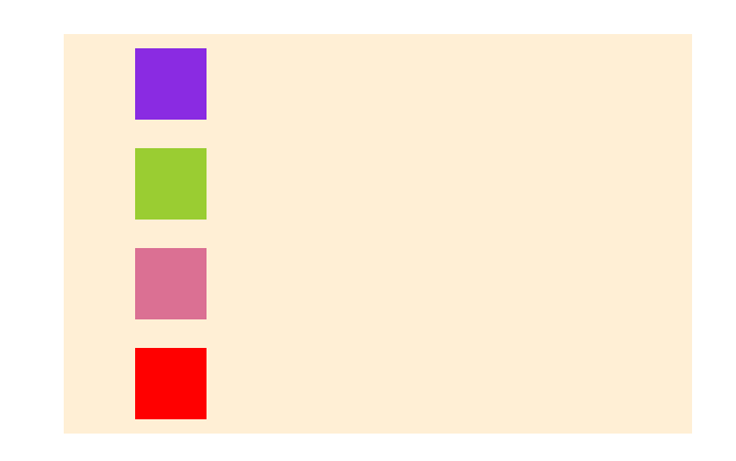
决定主轴方向
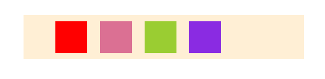
* `row`:水平方向 左 --> 右
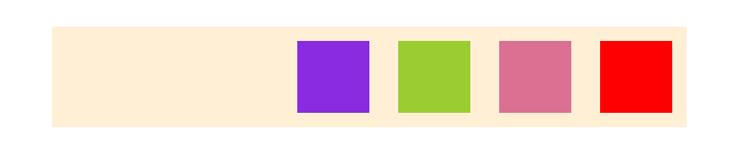
* row-reverse:水平方向 左 <-- 右
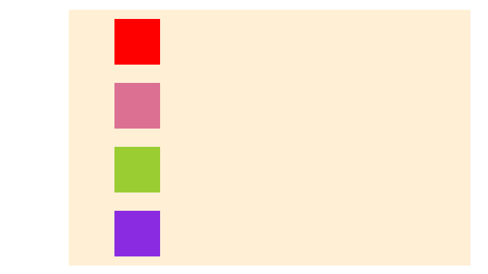
* column:垂直方向 上 --> 下
* column-reverse:垂直方向 上 <-- 下
示例
```html
```
```css
#father {
display: flex;
flex-direction: row;
position: absolute;
left: 50%;
top: 100px;
transform: translateX(-50%);
width: 400px;
background-color: papayawhip;
}
.child {
width: 50px;
height: 50px;
margin: 10px;
display: block;
}
.child1{
background-color: red;
}
.child2{
background-color: palevioletred;
}
.child3{
background-color: yellowgreen;
}
.child4{
background-color: blueviolet;
}
```
* row
* row-reverse
* column
* column-reverse
### flex-wrap
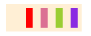
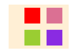
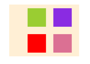
设置子元素的换行方式
* `nowrap`:不换行
* wrap:换行 上 --> 下 第一行在上方
* wrap-reverse 上 <-- 下 第一行在下方
接着上面的示例更改一下父容器的属性,下面的示例 `flex-direction`属性为`row`
```css
#father {
/* 改动的属性 */
width: 150px;
}
```
* nowrap
* wrap
* wrap-reverse
### flex-flow
其为 flex-direction 与flex-wrap的简写
```css
flex-flow:flex-direction flex-wrap
```
用上面的例子
```css
#father{
flex-direction:row-reverse;
flex-wrap:nowrap;
}
```
等价于
```css
#father{
flex-flow:row-reverse nowrap;
}
```
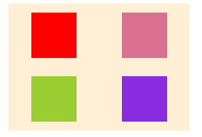
### justify-content
设置子元素在父容器主轴上的对齐方式
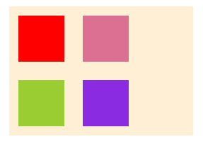
* `flex-start`:左对齐
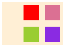
* flex-end:右对齐
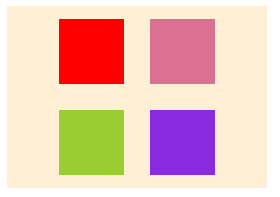
* center:居中
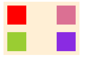
* space-between:两端对齐:每个子元素之间的间隔一致
* space-around:每个子元素两侧间隔一致
继续改动父元素的部分样式做实验
```css
#father {
width: 200px;
flex-flow: row wrap;
justify-content:flex-start;
padding:0;
}
```
* `flex-start`
* flex-end
* center
* space-between
* space-around
### align-items
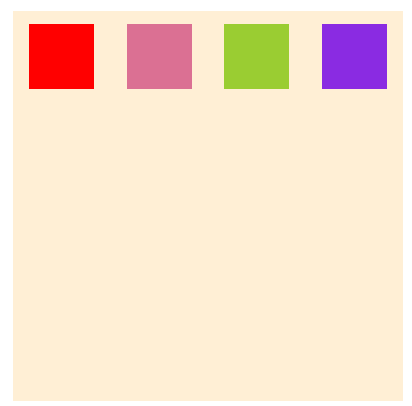
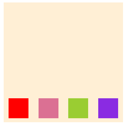
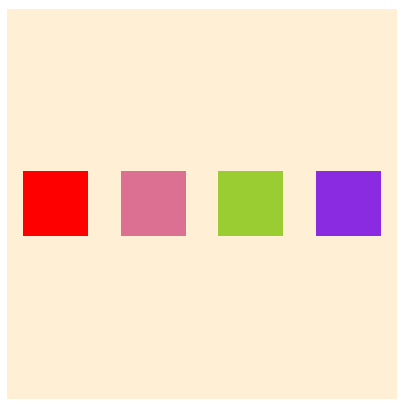
子元素在交叉轴上的对齐方式
* flex-start:交叉轴起点
* flex-end:交叉轴终点
* center:交叉轴中点
* baseline:以子项目的第一行文字为基线对齐
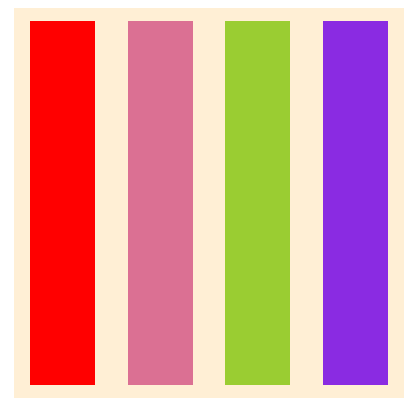
* `stretch`:未设置高度,将占满整个容器高度
```css
#father {
width: 300px;
height: 300px;
padding: 0;
flex-flow: row wrap;
justify-content: space-around;
align-items: flex-start;
}
```
* flex-start
* flex-end
* center
* baseline
```css
#father{
flex-flow: row wrap;
justify-content: center;
width: 600px;
padding: 0;
align-items: baseline;
}
```
```html
```
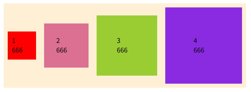
* stretch
去掉子元素的height属性
```css
.child{
/* height:50px */
}
```
### align-content
多行情况下的对齐方式,类似justify-content的对齐方式
* flex-start:交叉轴起点
* flex-end:交叉轴终点
* center:交叉轴中点
* space-between:交叉轴两端对齐
* space-around:每行之间上下间隔一致
* `stretch`:占满整个空间,下方留一些空白
## 六个项目属性
测试用例
```css
#father {
display: flex;
position: absolute;
left: 50%;
top: 100px;
transform: translateX(-50%);
background-color: #ffefd5;
width: 400px;
flex-flow: row wrap;
justify-content: center;
padding: 0;
}
.child {
width: 50px;
height: 50px;
margin: 10px;
display: block;
}
.child1{
background-color: red;
}
.child2{
background-color: palevioletred;
}
.child3{
background-color: yellowgreen;
}
.child4{
background-color: blueviolet;
}
```
```html
```
### order
规定子元素的排列顺序,数值越小越靠前,默认0
为child3,child4加上order
```css
.child3 {
order: -1;
}
.child4 {
order: -2;
}
```
加之前

加之后

### flex-grow
子元素放大比例,**剩余空间不足则不会放大**,默认0
注释掉子元素的宽高
```css
.child {
/* width: 50px; */
/* height: 50px; */
margin: 10px;
display: block;
flex-grow:1
}
```

改动第三个
```css
.child3 {
flex-grow:2
}
```
块3就是其它块的两倍宽度

### flex-shrink
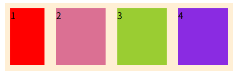
规定子元素的缩小比例,默认1,**空间不足则会缩小**
修改部分样式
```css
#father {
flex-flow: row nowrap;
}
.child {
width: 100px;
height: 100px;
}
.child1{
flex-shrink:3;
}
```
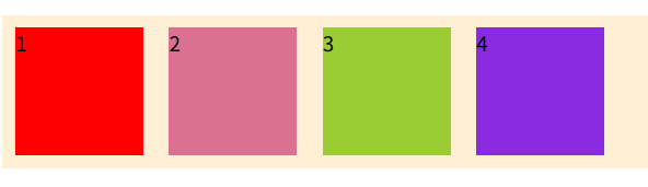
### flex-basis
修改子元素占据主轴空间的大小,默认`auto`为子元素的实际宽度
测试用例
```css
#father {
display: flex;
background-color: #ffefd5;
flex-flow: row nowrap;
padding: 0;
}
.child {
height: 100px;
margin: 10px;
display: block;
flex-basis: auto;
}
.child1 {
background-color: red;
}
.child2 {
background-color: palevioletred;
}
.child3 {
background-color: yellowgreen;
}
.child4 {
background-color: blueviolet;
}
```
```html
```
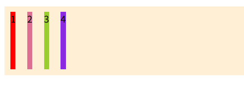
设置flex-basis为100px时
```css
.child{
flex-basis:100px
}
```
空间充足
空间不足
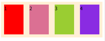
即当不设置width宽度时就以设置的flex-basis属性作为子元素在主轴上的宽度
### flex
flex是flex-grow,flex-shrink,flex-basis的缩写,默认`0 1 auto`,后两个属性可选
```css
flex:flex-grow flex-shrink flex-basis
```
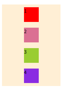
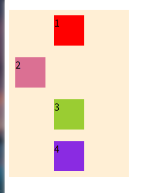
### align-self
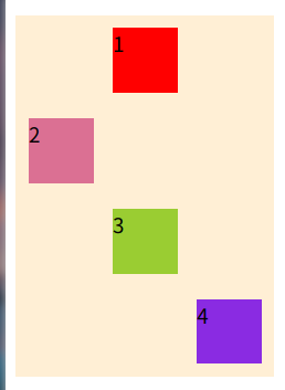
允许单个子元素与其它子元素有不同的对齐方式,可覆盖`align-items`属性 默认值`auto`
示例
```html
```
```css
#father {
display: flex;
width: 200px;
background-color: #ffefd5;
flex-flow: column nowrap;
padding: 0;
align-items: center;
}
.child {
width: 50px;
height: 50px;
margin: 10px;
display: block;
}
.child1 {
background-color: red;
}
.child2 {
background-color: palevioletred;
}
.child3 {
background-color: yellowgreen;
}
.child4 {
background-color: blueviolet;
}
```
让第二个左对齐
```css
.child2{
align-self: flex-start;
}
```
接着让第四个右对齐
```css
.child4{
align-self:flex-end;
}
```